
A carefully orchestrated balance between striking aesthetics and practical communication defines the FOGO packaging system. The color palette harnesses deep, smoky blacks juxtaposed with electric bursts of fire-inspired tones, ensuring strong shelf presence and immediate recognition. Typography choices reinforce FOGO’s bold personality, combining industrial strength with handcrafted authenticity—mirroring the raw power and precision of the BBQ craft.
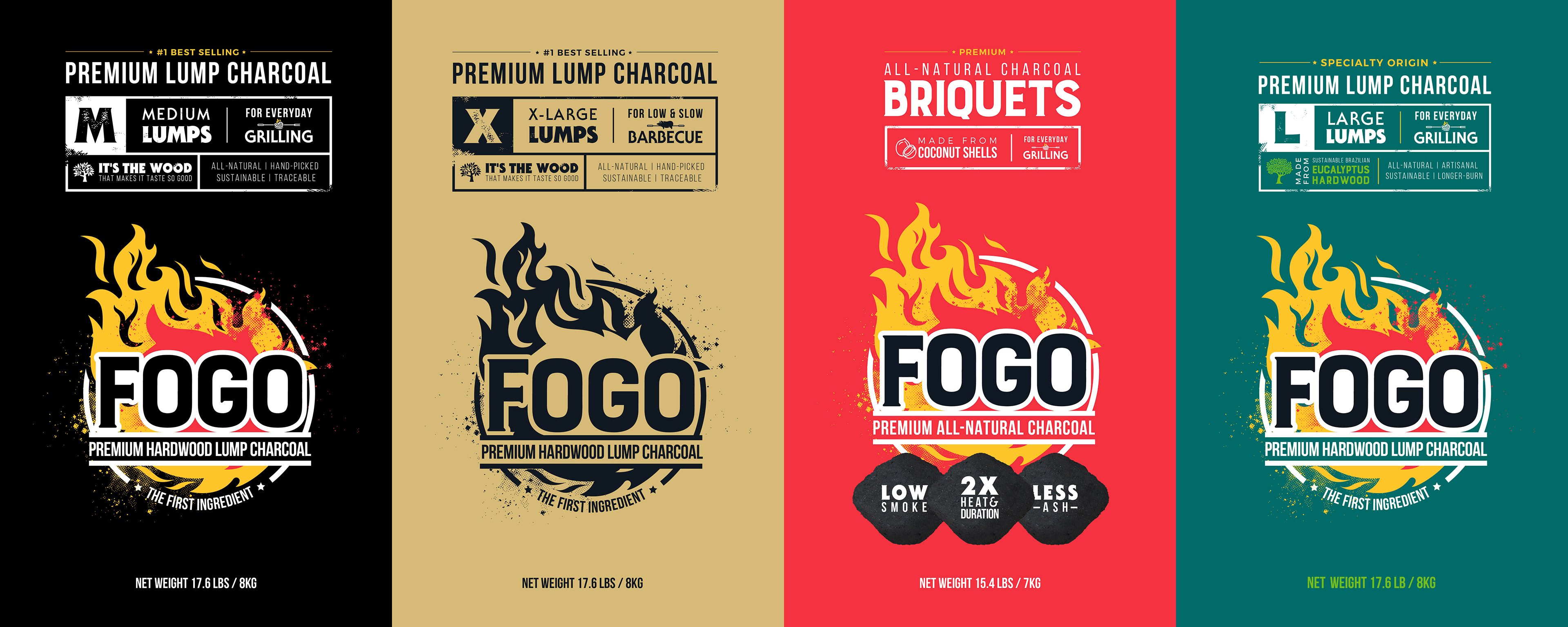
To enhance storytelling and usability, the packaging integrates clear product differentiation through structured information hierarchy, intuitive iconography, and tactile finishes that invite interaction. Material considerations were also paramount—sturdy, high-quality substrates echo FOGO’s commitment to excellence, ensuring both durability and premium tactility.


The result is a cohesive, high-impact visual system that not only establishes FOGO as a leader in the grilling space but also deepens its emotional connection with BBQ enthusiasts. This design solution transforms packaging into an extension of the brand’s fiery passion—igniting excitement, trust, and loyalty with every bag opened and every flame lit.

