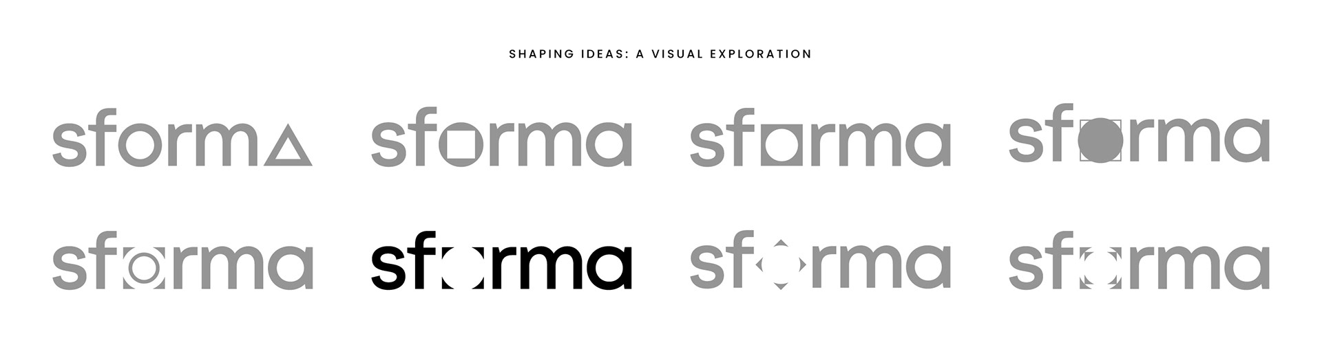
At its core, the Sforma wordmark embodies the ‘round peg in a square hole’—an intentional act of breaking the mold and transforming the industry. Its negative space invites participation, with the “o” at the center of the co-creation concept, where intersecting shapes prompt the viewer to complete the form. This subtle yet powerful gesture reflects Sforma’s ethos—cocreation shaped through perspective, interaction, and intent. Every typographic decision, spatial relationship, and color choice was calibrated to reinforce sforma’s role as a disruptor in the real estate industry.
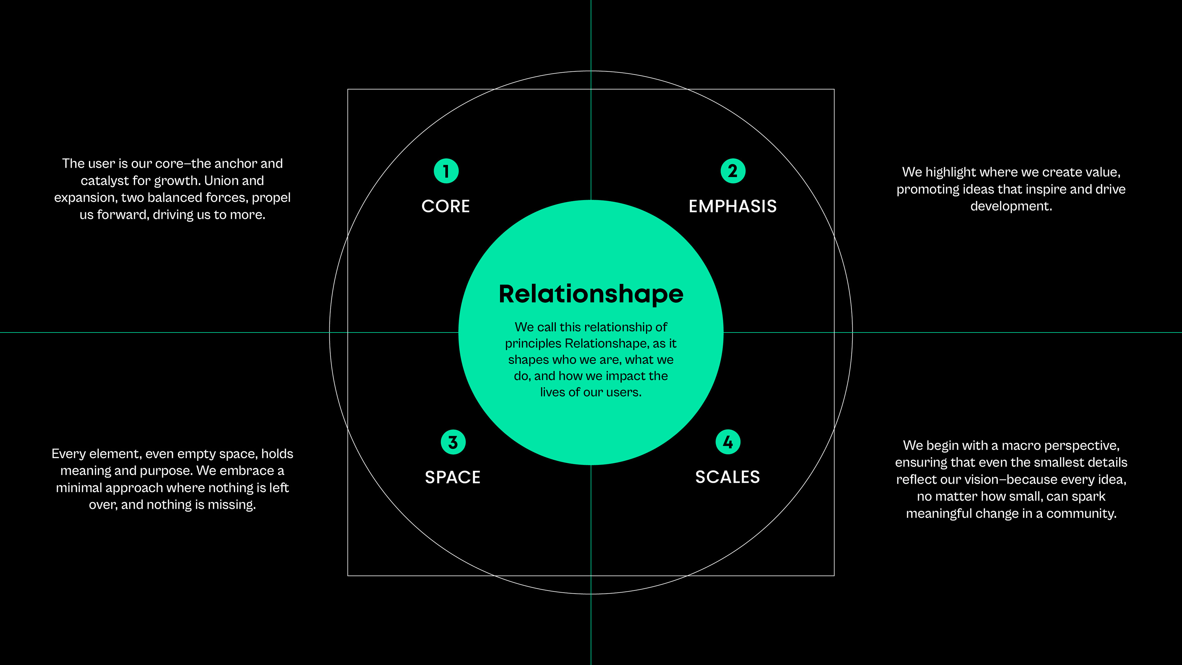


The brand system was designed for scalability. The modular identity flexes across applications—from corporate assets to digital platforms—maintaining coherence while allowing for contextual adaptability. The result is a visual and strategic framework that redefines how real estate developers engage with communities, investors, and visionaries alike.